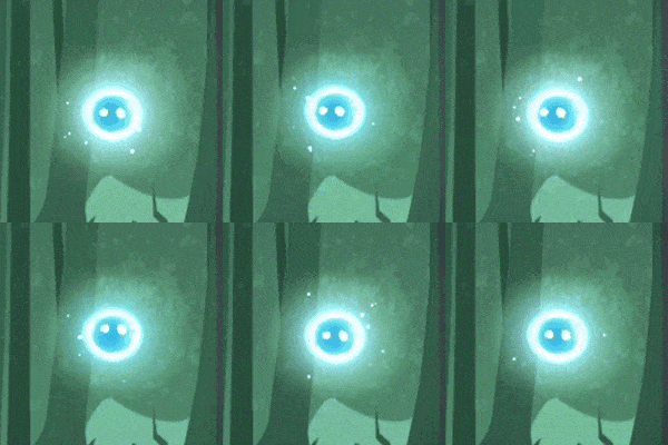
Heli's Updated Look
We are super excited to show you some of the graphics polishing we have been doing, following on from our last post. We mentioned a while back that Louise had been trying out some changes to how Heli's orb would look (we normally just refer to this as Heli, as it is a part of her), and today we can finally show off what we have ended up with.
The first step took quite a long time; concepting and trying to figure out how the orb itself should look, and what facial expression it should have etc. The Heli that you saw during our Kickstarter campaign was also the one we used in our prototype, and it was actually pretty rough around the edges (literally). It was just a singular flattened PNG with a Unity light source behind it. Lou tried a few variations, and sketches on how the Heli orb might look, but nothing felt right, and one of the biggest reasons was that we had been playing the game with THIS Heli for so long, so every variation just felt out of place. In fact, we had been playing with some of the new Helis for a while, feeling they weren't right, till James suggested maybe we just go back to the original, and rather tweak and polish her up. Sometimes when you work on something for a long time, it can be really good to get out of your own bubble and get a different opinion to put you back on track!

To some it might not seem like a huge change, but take a closer look and you can see a big difference, especially when you play the game. We cleaned up and polished Heli's visual, cleaning up the texture, improving the coloring and making her more luminescent. We then split the asset into 7 layers, each with their own settings, animations and shaders. The result was a Heli who looks much more dynamic and alive, as opposed to the very static almost paper cutout version we had before. We also greatly improved her both how she looks when she's idle and moving, how she glows and lights up the scene.

One of the other big challenges was nailing Heli's trail. We wanted her movements to be highlighted by a really magical trail following her, but it was tough to balance, not wanting something too over the top and distracting, but neither wanting it to be plain and boring. Neither Louise or Christian are VFX artists, so this was a HUGE learning curve, and we have so much respect for the people who work in this field, after spending a few weeks gaining an understanding for it. We made about 10 different trails before getting it just perfect, and took a lot of inspiration from the amazing VFX work in Zelda: Breath of the Wild to get there.

We hope you like the new and improved Heli! Do let us know what you think in the comments! We will be back soon with another update before the new year, so in the meantime make sure to stay warm and don't catch a cold (for those of you in the northern-hemisphere)!
- Team DinoByte Labs


